Accessibility-Focused Design
This one dives into the design thinking process.
Kristin of Advocates & Allies has different target audiences while working with different ventures. With her consulting and service company A&A she works with families to provide guidance and support when navigating the 504 and IEP process.
Kristin wanted to spruce up her visual branding on LinkedIn to make it more clear that A&A was a separate venture than her work with Bridging the Educational Gap. Her only “must” was that we had to use yellow. She had a good concept already in her logo and I really thought that by brightening up the colors and researching the meaning of the colors it would better help tell her mission’s story. I love a challenge, so I put my research skills to work to come up with some options just in case I might land on a fresh perspective.
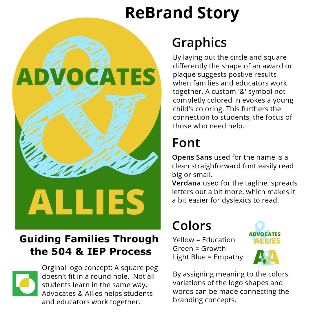
Yellow is commonly associated with education so right away that was going to help tell her story. After some research and mood boards I gave her 4 concepts for directions she might consider for a memorable logo that tells a story. I came up with the 4th concept while jet-lagged, so I wasn’t sure how it would be received or if I should present it at all. I was playing with the circle and square shapes to combine them into the suggestion of an award, ribbon or plaque because when school systems and students/families work together with the help of an advocate like Kristin, they all win.
Much to my surprise it was the one that resonated most. Volia! Then I got to work crafting variations and researching fonts. One of the modern challenges when designing logos is to make sure they are readable when very small. Case in point: would it be recognizable in a LinkedIn business logo on a profile page? Logos with words often lose visual clarity when they are that small. It was going to be a creative challenge to make sure Kristin had alternative shapes to be used in different marketing materials while staying on brand.
I typically like the shape of a logo to become the main visual brand. I like to call this the "icon" and I refer to it as the "logo" when I add additional words and or taglines to the icon. The decision to choose 3 colors with specific meanings was key to making the secondary icons work. Check out the rebrand story below for more details.
If you are looking for a brand refresh, new logo, or need help designing a more impactful LinkedIn banner email me: pattie@tealbranding.com.
Not sure what you exactly might need or just want to see if we are a good fit to collaborate? I’m happy to have a free introductory consultation call. If you want to jump right in to discuss a specific project, my fee is $75 for 1-hour brainstorming session.*
- If you decide to collaborate with me to build out your visuals, the $75 will go toward that fee. My calendar is flexible right now so let's talk next week for the best pricing.
#brandidentity #logodesign #linkedinbanner #youtube #marketing #design #graphicdesign #tealstudio


